

As Texas State University continues to grow and advance, we are evolving our university logo — not with a dramatic shift, but with a thoughtful update that honors our history and positions us for the future.

Our brand must reflect who we are today and the bold aspirations that lie ahead. As we move toward our long-term vision of serving 50,000 students across our San Marcos and Round Rock campuses, achieving R1 research status, expanding community college partnerships, growing online degree offerings, and exploring future international locations, we need a logo system that effectively represents this expanding impact.
The logo was developed by our in-house team — people who live and breathe this university every day, and who understand our unique identity and trajectory.
Evolving the Texas State University Star and Beyond
"While our visual identity is evolving, our spirit, mission, and pride in TXST are unwavering. This updated identity strengthens our foundation and better supports the scale, reach, and impact of the university now and in the future." - President Kelly Damphousse
This is an evolution — not a revolution. The new typeface is bolder and more legible across sizes and screen types, making it far more effective in digital and small-format use cases. It performs better when paired with partner logos, resolving alignment and scale issues that occurred with the 2003 logo.
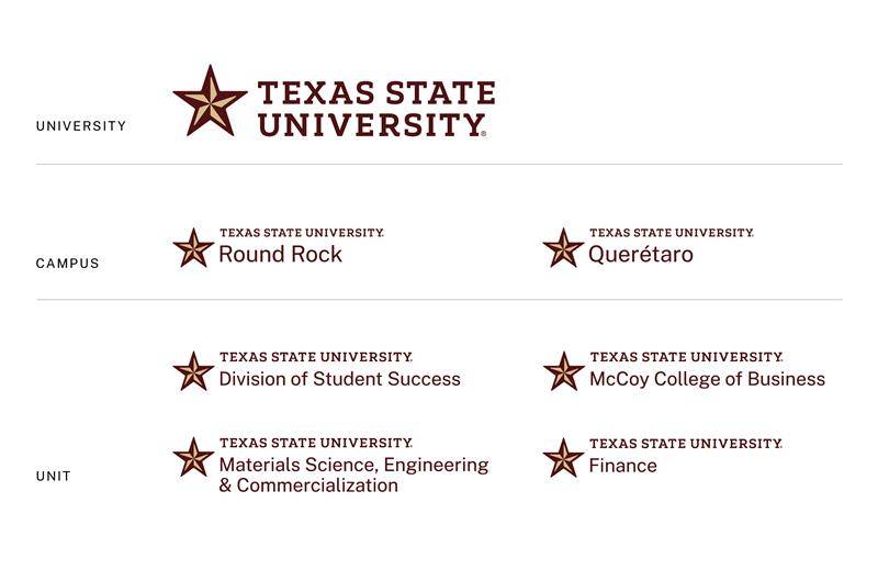
The refined Texas State star is visually cleaner and more distinctive while maintaining a connection to our heritage and history. Meanwhile, the entire system establishes a logical hierarchy for campus, unit, and institutional logos, creating a more consistent brand identity as we expand to new audiences, markets, and platforms.
Finally, the gold has been updated to Texas State Bright Gold to increase contrast with Texas State Maroon, align our primary logos with the gold of our Athletics teams, and improve accessibility by meeting federal contrast standards for digital content.

Unit Logos
Texas State is launching official program logos for the first time. These tailored marks are designed to unify the university’s visual identity while giving individual programs a stronger, more cohesive presence.
Why now?
Our previous logo system lacked clear hierarchy and visual consistency. This update ensures every division, department, unit, and program communicates with clarity while still aligning with the university brand.
Where do I get them?
Approved program logos will be available for download via Canto, the university’s centralized digital asset management platform. Faculty and staff can access these logos for use in digital, print, and promotional materials.
What’s Next?
- Official Rollout: In early August you will begin to see the new logo integrated across campuses, digital platforms, and official materials. To mitigate costs, we will slowly transition to the new logo as signage and collateral materials need to be replaced.
- Updated Resources: Faculty and staff will receive guidelines on how to implement our updated branding.
FAQs
-
Background
-
Why is Texas State evolving its logo?
It’s been more than 20 years since our previous logo was introduced, and the university has changed significantly over the decades.
With the goal of expanding access to 50,000 students across all our campuses — including those in San Marcos, Round Rock, future international locations, community college partnerships, and online programs — we need a logo system that reflects our growing reach and future ambitions.
The updated logo is an evolution of our existing identity — not a radical departure. It supports Texas State's long-term growth strategy by addressing key limitations of the current academic logo, which was developed at a time when the university had roughly half the students, a developing Round Rock presence, and a developing research enterprise.
-
What challenges did the old logo present?
The 2003 logo lacked clarity and hierarchy, making it difficult to distinguish between institution, campus, and unit-level communications. The serif typeface in the 2003 logo, while traditional, lacked legibility at small sizes and often looked diminished alongside partner logos and in digital environments. Co-branding was a frequent challenge due to the 2003 logo’s inconsistent sizing and lack of visual weight.
-
How does the new logo improve upon the old?
This is an evolution — not a revolution. The new typeface is bolder and more legible across sizes and screen types, making it far more effective in digital and small-format use cases. It performs better when paired with partner logos, resolving alignment and scale issues that occurred with the 2003 logo. The refined Texas State star is visually cleaner and more distinctive while maintaining a connection to our heritage and history. Meanwhile, the entire system establishes a logical hierarchy for campus, unit, and institutional logos, creating a more consistent brand identity as we expand to new audiences, markets, and platforms. Finally, the gold has been updated to Texas State Bright Gold to increase contrast with Texas State Maroon, align our primary logos with the gold of our Athletics teams, and improve accessibility by meeting federal contrast standards for digital content.
-
Which logos are evolving?
The Texas State University Primary and Secondary logos, the Round Rock logos, and the Academic and Administrative logos are evolving.
-
Which logos are NOT affected?
The TXST Acronym logos and the Athletic logos — including SuperCat — as well as the University Seal will remain the same.
-
Is Boko or the SuperCat logo changing?
No. Boko, the SuperCat logo, the illustrated mascot, and other Athletics logos are not affected by this update.
-
-
Adoption process and timeline
-
When will faculty and staff have access to the new logo?
Faculty and staff will have access to the new logos on August 4.
-
Can I still use the old logo?
Continue using the old logos until August 4. Once the new logos are released, you must discontinue the use of the old logos.
Digital materials must be updated immediately upon release. To make the most of university resources, you may continue using the old logos on physical materials until stock runs out and needs to be reordered.
-
Will university campuses, departments, colleges, etc., get new logos?
Yes, new Campus and Partnership Logos and Unit Logos are being created and will be available on August 4. Logos will be distributed through our Brand Guidelines site and our digital asset management system, Canto.
-
Can I create my own version of the logo for my department, program, or unit?
No. All logos will be created by the Division of Marketing and Communications and must not be altered in any way.
Unit Logos will be distributed through our Brand Guidelines site and our digital asset management system, Canto, beginning August 4. If your unit’s logo is not created during our initial launch, there will be a request form available.
-
-
Assets, templates, and merch
-
When will Canva templates have the new logos?
Canva toolkits and templates will be updated with the new logos and available in August.
-
Will there be updated business cards and stationery?
Yes, updated business cards and stationery will be available to order on August 4. You may use up any remaining stock with the old logos before ordering new stock.
-
Will there be updated templates for PowerPoint, email signatures, Teams backgrounds, etc.?
Yes. Updated digital templates will be available on August 4.
-
I need to order new brochures/posters/pens/shirts/etc. for the coming year soon. Can I have the new logos now?
No, we will not be distributing the new logos until August. If you must place an order before then, it’s OK to use the old logos.
-
When can I get merch featuring the new University Logo?
Our licensed vendors will have the new logos soon, and items should be available to order by August.
-